Learn what responsive web design is and how it can impact your business.
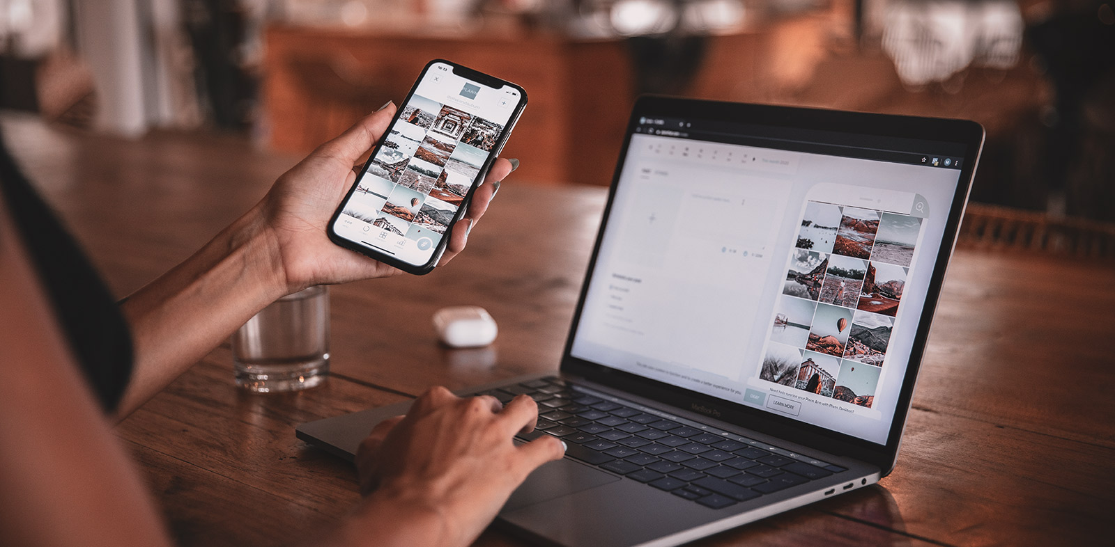
If you use a website to grow your business, or you’re thinking about investing in one, and you haven’t heard the term “responsive design”, this post is for you. Responsive design is going to change the way visitors to your website engage with your business.
What is responsive design?
Responsive design is basically web design that optimizes your users’ experience based on their device’s screen size and orientation (as in which way they’re holding their device – portrait/landscape).
This means you can look at the same website or app on an Android phone, an iPad, a laptop, or desktop computer, and – it doesn’t have to look exactly the same – but will look good and function well on any of those devices.
88% of users will stop engaging with web content if it doesn’t display well on the device they are using.
Ideally, responsive design allows us to use the functions on a website intuitively. You should be able to see everything comfortably without pinching or zooming or scrolling from side to side to see everything on the screen, click a button or use a feature.
Why responsive design matters
Implementing responsive design can increase traffic to your site, improve customer satisfaction, and grow conversion rates. On the other hand, unresponsive design could cause visitor frustration and cost you potential customers.
61% of users won’t return to a site on mobile if they had trouble accessing it and 40% will visit a competitor’s site instead!
Responsive websites generally load faster. Even one second can make all the difference for a mobile user, so a faster load time keeps potential customers on your website instead of looking for an alternative.
Bonus: you improve your search engine rankings with faster speeds! Keep in mind also that Google prioritizes responsive sites in search results.
If your users have a positive experience on your mobile site, they are significantly more likely to buy a product or service.
70% of users have abandoned their shopping carts because of a poor experience BUT 90% of smartphone users say they’d continue to shop at a particular site if they have a good user experience.
Responsive design is also cost-effective for you because it future-proofs your website. With more devices on the market being introduced constantly, a responsive website ensures your online presence looks good and works well no matter the device and minimizes any adjustments you might have to make later.
How do I design a website that is responsive?
1. Define your website’s goal
Identify what you want your visitors to get out of their website experience, whether that’s information, a purchase, or something else entirely. Then make sure your website allows your visitor to do just that, regardless of the device they’re using.
Test your website on different devices to confirm that your design and layout works, or use a tool that allows you to compare how your site looks on different screens and orientations. (I’ve included a nifty tool in the resources section below.)
2. Understand your users
Whether you’re hiring a web designer or building your own website, it’s essential to try to understand how your visitors will be using your website.
Will they be booking an appointment on their mobile phone? Pre-shopping on their smartphone and then making purchases on their laptop? Or are they looking for detailed information about a service or product you offer?
You may want to offer different things to users based on the device they use. Clearly define how you want users to interact with your site and ensure your design caters to that objective.
If you already have a website, an analytics tool can help you optimize your website based on actual user behaviour rather than guesswork. (Check the resources list for a couple of options.)
3. Design your website with a mobile-first approach
Since mobile traffic makes up at least 60% of all internet traffic, take a mobile-first approach when designing your website.
Prioritize your content, images, and features for mobile devices. Remove anything that is unnecessary on a smaller screen. Keep your forms simple and reduce the number of fields to fill out.
How does your site look on a mobile phone versus on a laptop? Do you find yourself having to scroll horizontally on a smaller screen? Are you zooming in to read the text? What can you do to make your website simpler for visitors to navigate and use on mobile devices?
Think about touch screens and how people use them. Are your buttons too small or too close together for the average user’s fingers? Is your call-to-action button too far away from a user’s thumb, forcing them to stretch or switch how they are holding their mobile phone to click on it?

Responsive design can get pretty technical, but it’s something you should definitely be thinking about if you want to ensure your digital presence is drawing traffic, satisfying customers, and generating sales.
If you’re feeling uncertain about your website and how to make it more responsive, send me a message and I’ll be happy to answer your questions!
Resources
- Resizer by Google Design: There are different ways to check your website responsiveness (including browser tools) but here’s an easy one. Just pop in your website address to see what it looks like on different devices and in different orientations. Or try it out with other websites to learn what they are doing.
- Analytics tools to help understand your users and how they engage (or don’t) with your website: Google Analytics, Matomo.